Space Force Identity Proposal
In 2020, a new division of the United States armed forces was proposed: Space Force. Initially lacking a seal, emblem, or identifying marks, I seized the opportunity to create four proposed concepts and submitted them for consideration.
Each design was meticulously crafted to reflect the time-honored tradition of incorporating our national symbols, communicating the quintessential American attributes. The American eagle represented independence, while the 13 arrows symbolized strength of arms. An olive branch with 13 leaves signified our commitment to peace, and a shield with 13 stripes epitomized unity in defense, all underscored by 13 stars representing our founding colonies.
Ultimately, a design featuring a delta ensign was selected. This emblem, first used in 1961 by the USAF Space Command, provided a seamless link to the Space Force's legacy rooted in the United States Air Force.
Video watch time 00:00:56

A Higher Calling
In this design, America's eagle has broken free of gravity's grip. It is now a sentinel perched high upon Earth's canopy to defend America's liberty.

Reaching for the Stars
With the eagle's outstretched wings, upward posture, and both the moon and Mars as backdrops, this design depicts freedom's far-reaching aspiration beyond the confines of this world. It is named for a song of the same name from Johnny Cash's 1972 album, America.

The Sky's the Limit
This design juxtaposes the power of liftoff rocket thrust with a planetary orbital ring to communicate there are no reaches too far afield to keep us from our mission.

Re-entry Eagle (Coming in Hot)
The elements in this design represent the rupture of the hypersonic barrier. The 13 red and white rays stretching back from Earth's atmosphere take the place of the shield that ordinarily adorns the eagle's chest. This design communicates swift and decisive action.
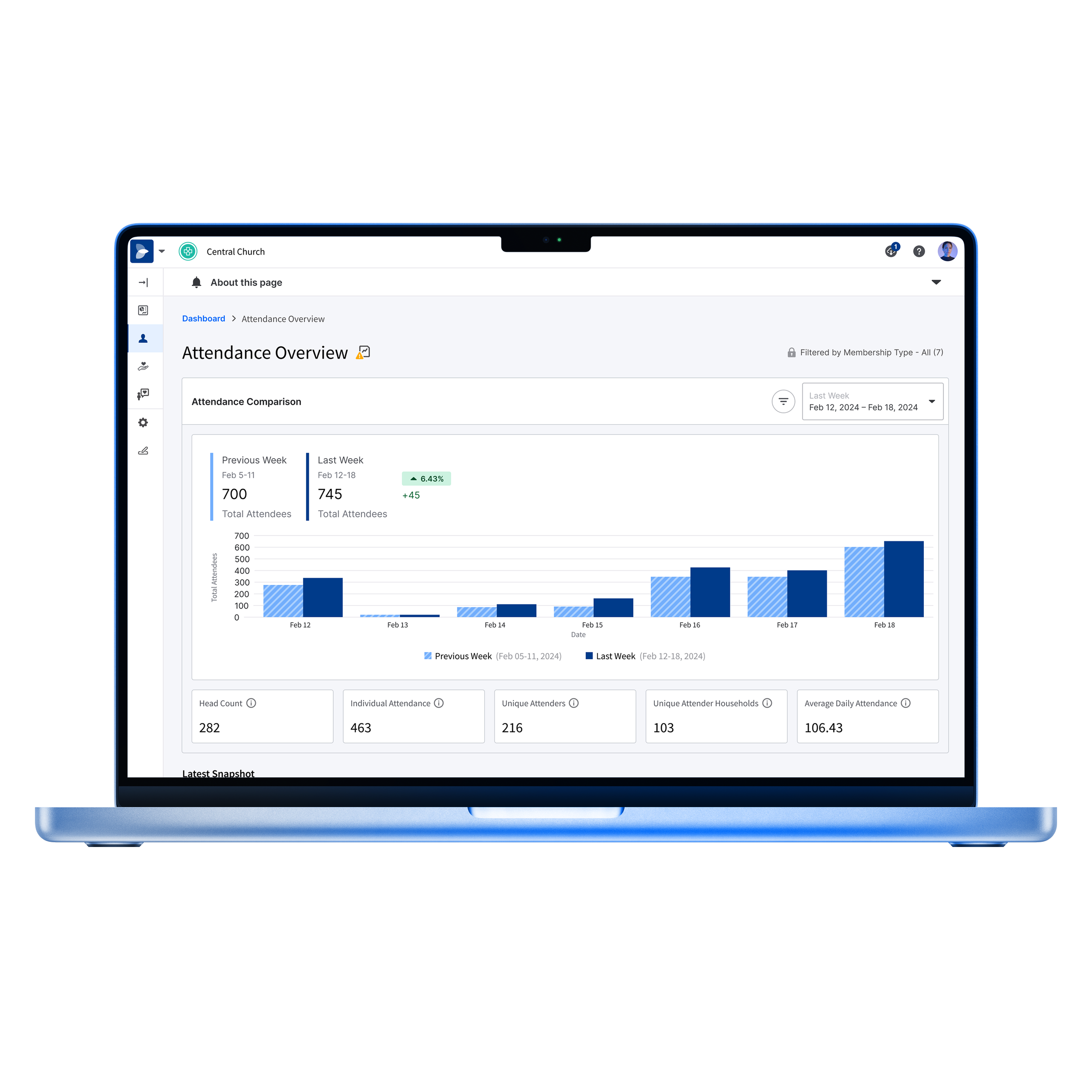
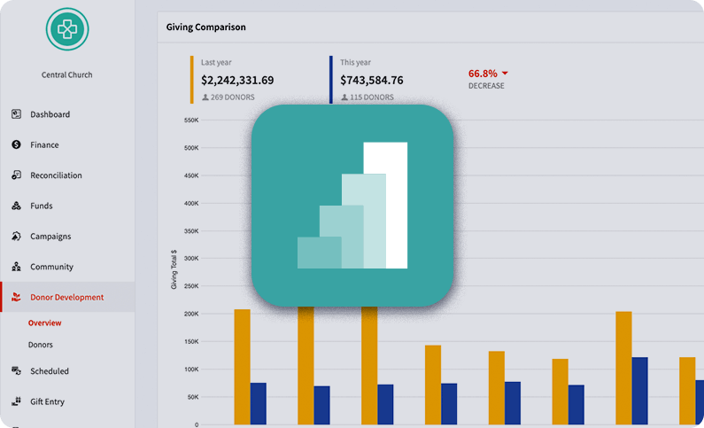
Pushpay Insights Branding & Product Launch
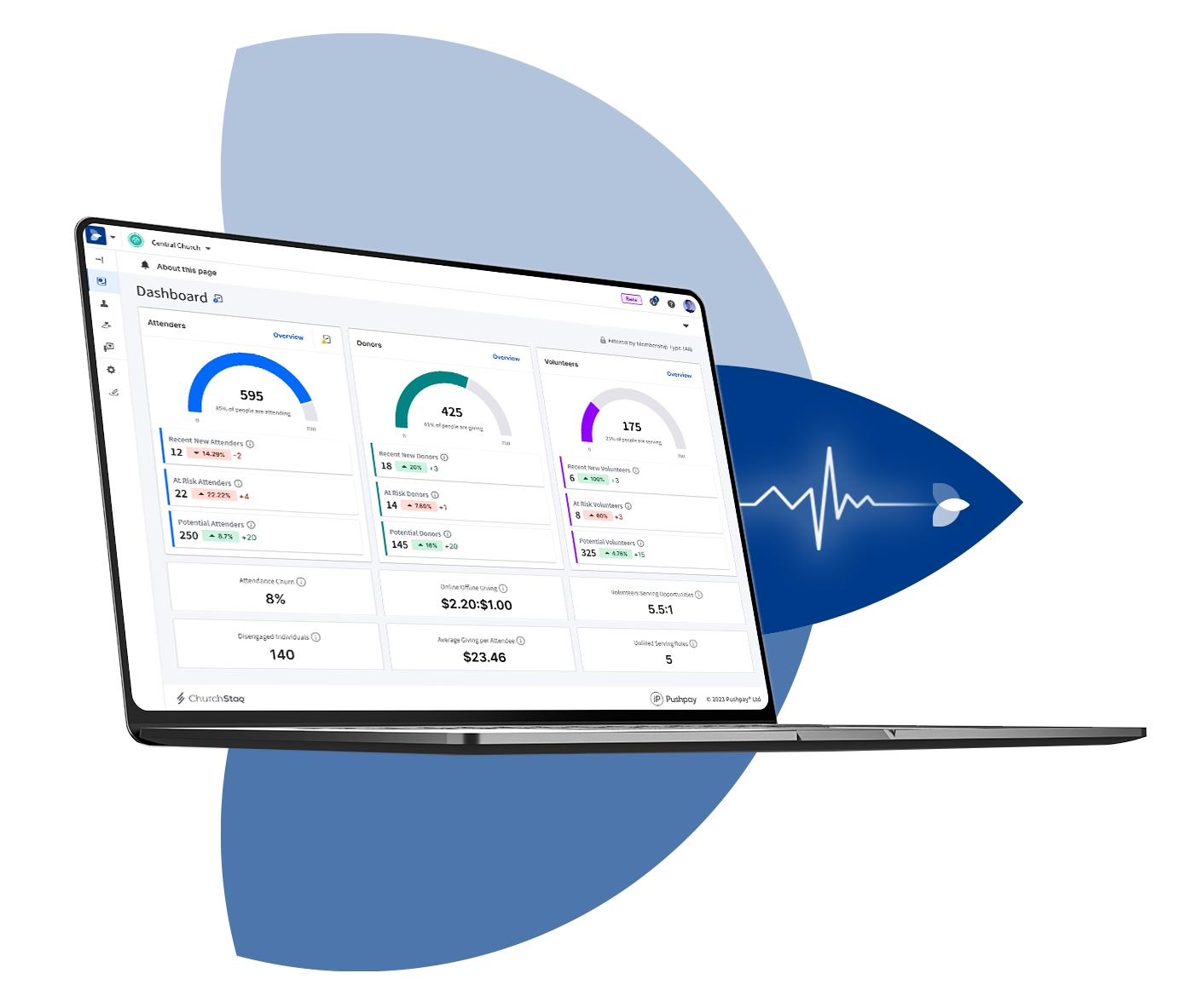
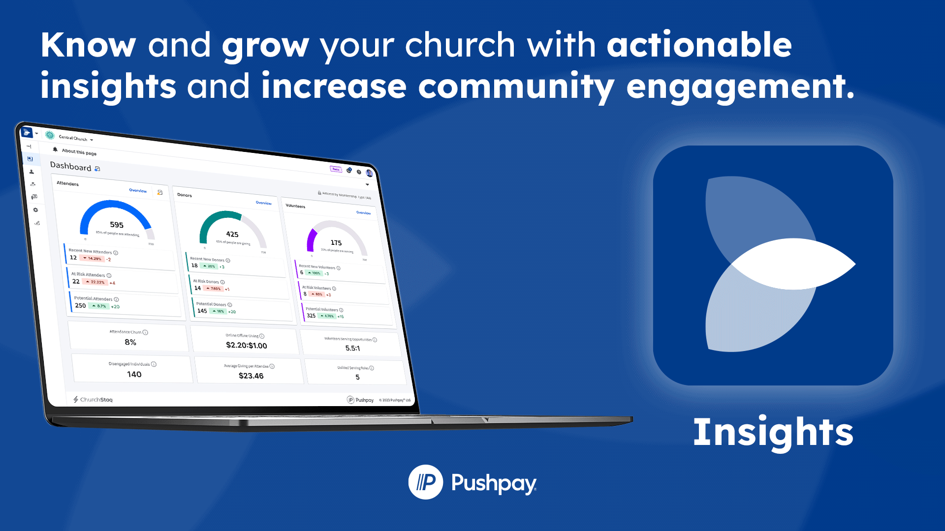
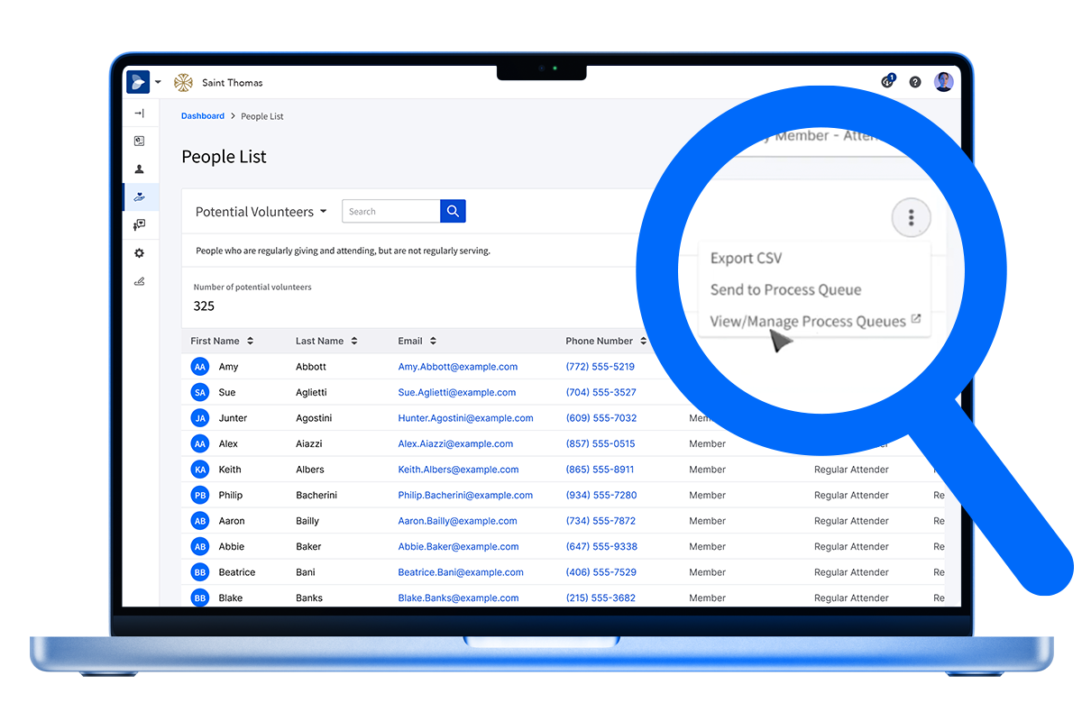
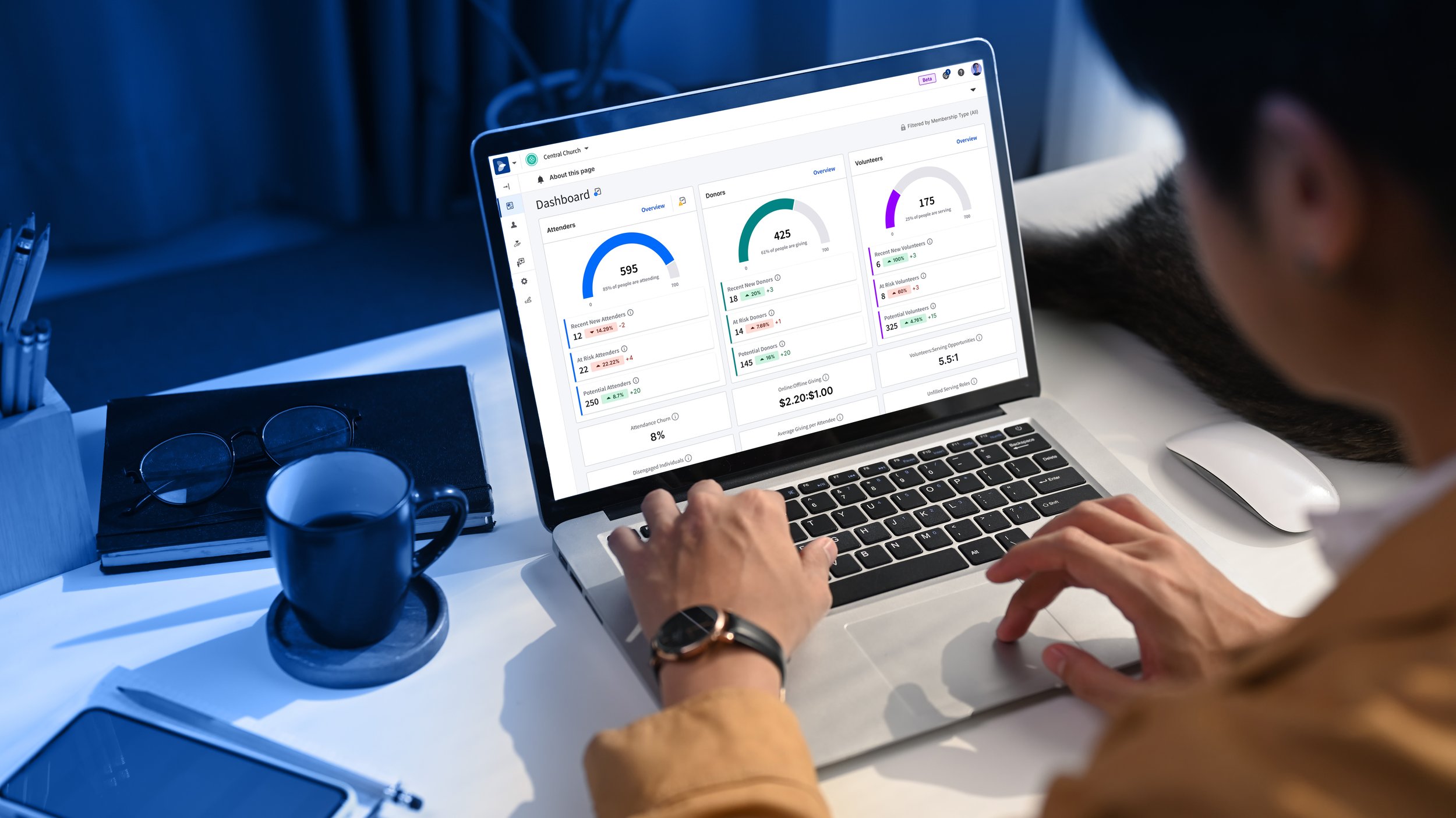
Pushpay was launching a new-to-market software solution aimed at integrating data from our Giving product and Church Management System to seamlessly provide customers with actionable recommendations about their communities.
The task was to design an identifiable product mark, name, overall graphic styling that could integrate into our brand architecture, and create videos, web pages, and marketing materials to communicate the core benefits of the software solution.
The first step I took was to write a creative brief capturing all the details about the forthcoming software and circulated it with the product manager and executive leadership. Next, I worked with senior leadership to identify a shortlist of names. I began designing marks that fit our brand's product mark aesthetic and design principles. After establishing the name Insights and the mark, I led our animator in visualizing the data sets coming together. Our designer developed several options for a graphic language, and we settled on the EKG line. We built a script, storyboard, and timeline for our video shoots, and for any concerns during the shoots, I developed a fail-safe plan.
The new product launch was successful, despite delays in product user-interface designs. My team delivered a visual-and-product-messaging guideline on time.
Team
Creative Director | Daniel Ramer
Videographer | Maryanne Aberion
Animator | Mortada Gzar
Writer | Sarah Long
Designer | Pete Cooley
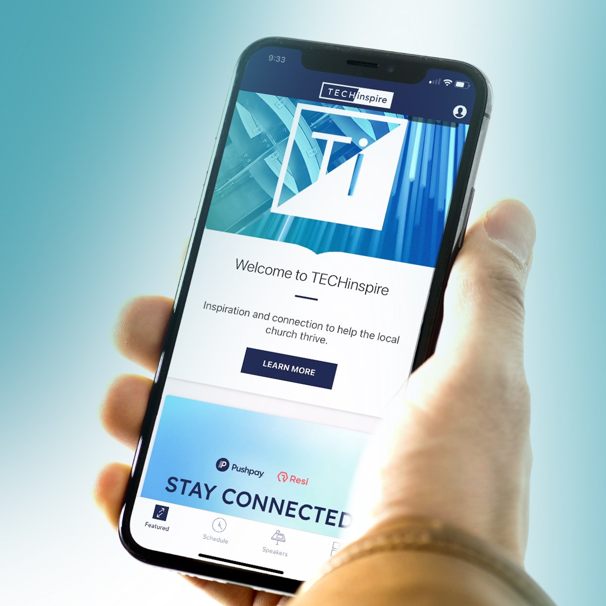
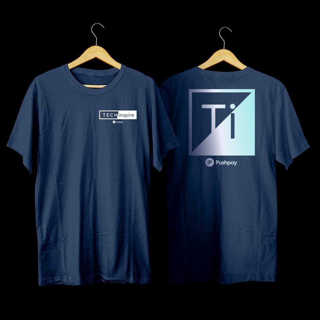
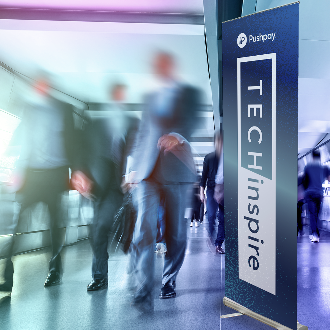
TECHinspire Event Brand
Pushpay was launching a small regional, in-person thought leader event focused on bringing together church innovators, leaders, and influencers.
The objective was to create a brand identity that was unique, memorable, understandable, and desirable to our target audience.
I worked closely with my copywriter, and together we distilled the creative brief. This led me to produce three mood boards followed by fully realized concepts. I led our team in writing short, medium, and long event descriptions for each concept.
The branding concept comes from the idea of an elemental reduction of titanium the cutting edge of iron sharpens iron. TECHinspire is reduced to its initial letters Ti to call to mind the atomic symbol for titanium. This metal is recognized for its strength, its durability, and how lightweight it is. It is a staple of aerospace and biomedical application. It is a symbol of technological innovation. Tech Is blazoned in white and inspire is in inverse to call to mind the concept of inspiration illuminating darkness.
Team
Creative Director and Designer | Daniel Ramer
Writer | Malcolm Freberg
Videographer | Maryanne Aberion
Web Designer | Jimmy Barker

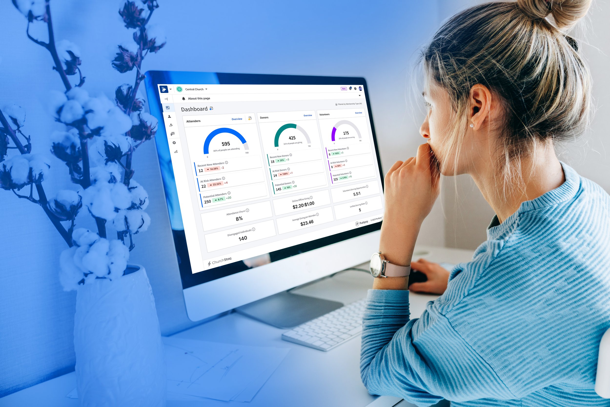
Pushpay, ChurchStaq, & Product Brand Architecture
Pushpay, as a startup, lacked clear product brand distinction. Our giving and donor management platform bore the same name as our holding company. This issue came to a head with the acquisition of a competing Church software company called Church Community Builder. Suddenly, we found ourselves with two brands that were also product names, without a method to bundle them together.
The task at hand was to develop a 1-3 year plan for the brand architecture. This plan needed to establish meaningful distinctions for our offered products and provide a clear communication channel for our sales and marketing teams to convey the benefits of each product. Additionally, we needed a pathway for creating new products or acquiring other brands.
I began by researching how other SaaS companies had addressed similar challenges. I developed four brand architecture models, recognizing the necessity for a packaging bundle brand—a name that customers could use to refer to all our products collectively. Furthermore, we realized the importance of renaming each product with a simple, logical name that encapsulated its function. User testing, conducted with our Product User Experience team, helped identify colors, emotions, and shapes that resonated with each product's user groups.
The end result was a cohesive brand hierarchy, highlighted by the introduction of ChurchStaq. This served as a product container for Giving, ChMS, Apps, and was designed to accommodate future additions, such as Resi Media or Insights introduced in 2024.
Team
Creative Director | Daniel Ramer
Animator | Mortada Gzar
Designers | Pete Cooley, Sabrina Zhou
Writers | Luke McKoy, Malcolm Freberg, Sarah Long
Together We Campaign
With the acquisition of several competing church space technology companies, an unhealthy "us vs. them" dynamic began to emerge.
The struggle was to refocus our internal teams, shifting their focus away from past practices and towards the collective achievements of a stronger, more unified company.
To address this, I initiated a research project titled "One Pushpay." We sought feedback from our teams about our collective accomplishments. Conducting an internal survey, we asked for words that inspired our work. These words were then printed on individual "Together We ____________ " t-shirts, customized to each team member's size. Additionally, we embarked on a "Together We ____________" road trip, interviewing customers about how Pushpay and their organizations had positively impacted the world.
The result was a campaign that spanned over three years, evolving from an internal unification program to becoming integrated into our human resources growth initiatives. This included programs such as "Together We Learn, Grow, and Lead," annual "Together We" awards, "Together We Hack" hackathons, and it even became the core mantra of our company: "Together We Connect."
Team
Creative Director | Daniel Ramer
Videographer | Maryanne Aberion
Animator | Mortada Gzar
Resi Media Rebrand
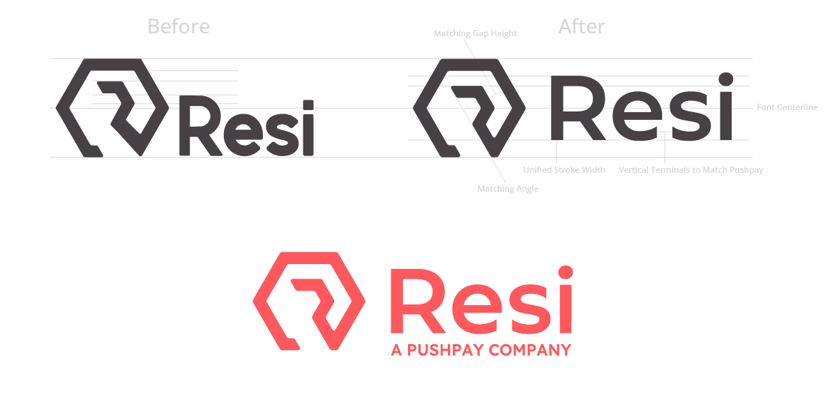
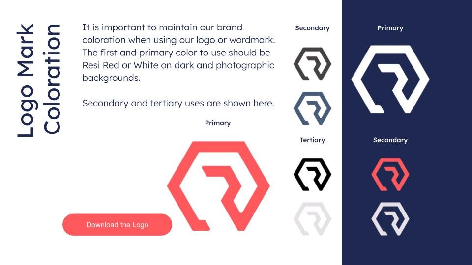
Upon the acquisition of Resi Media by Pushpay, it became evident that the brand lacked a unified structure, voice, or tone, as well as a consistent video or visual style guide. Furthermore, it was utilizing five fonts for its typography without clear documentation of licensing for the main logo font.
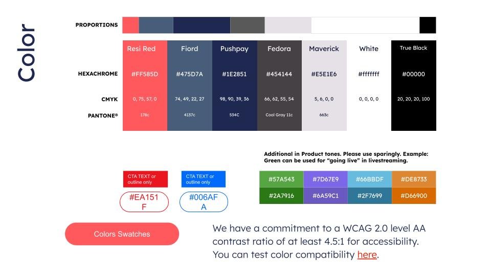
The feat at hand was to establish a new logo standard, develop comprehensive brand guidelines, and adjust colors to align with the parent brand, Pushpay. Upon discovering the uncertain status of the font license, I sought counsel from our legal team, who recommended discontinuing the old logo within one to three months for all digital usage. In line with the main color and the hexagon R logo mark, I redesigned the main logo to match the sizing and typographical treatments of the Pushpay brand architecture. Once the redesigned logo received approval from executive leadership, I led a working group over the next three months to identify areas where the old logo was present and replace it, ranging from old email footers and in-product logos to neon lights and a full website redesign. Subsequently, we rolled out the new brand guidelines, with Pushpay's brand hierarchy as a subsidiary sharing a subsection of the color palette, typographic treatments, and incorporating a robust icon and illustration system.
The final result is a consistent brand appearance and the ability for Resi to share content with Pushpay customers without the need for a full-fledged redesign of brand characteristics such as icons, illustrations, and secondary color usage. This has saved Pushpay countless work hours and mitigated licensing uncertainty.
Team
Creative Director | Daniel Ramer
Web Designer | Jimmy Barker
Designer | Sabrina Zhou

Pushpay Summit 2019
In 2019, Pushpay launched a live two-day user conference, hosting 1,300 attendees, comprising both customers and prospects from across the country. The event featured five stages across multiple tracks.
The primary objective was to rebrand the event to align with our core brand at the time, creating a unified experience throughout the event space, providing a meaningful learning experience for the attendees, and implementing a smooth navigation system for the rotating events. Additionally, I was responsible for producing the event presentation designs and overseeing the stage design. We also planned a product launch for the second day, introducing our new app features, Dynamic Home Screen, and Rich Push Notifications, necessitating a strategy to generate excitement for these launches.
This marked the fourth in-person conference I led the design for. Initially, I requested extensive floor plans and photos of the event space. Working closely with the event manager, we strategically positioned various stages. Concurrently, I used event space photographs to create photorealistic renderings of event booths, signage, and decor. These concepts were presented at our weekly steering committee meetings, providing our CMO with a clear and up-to-date progress report.
Recognizing the diverse interests of the five user personas attending the event, I proposed color-coding each persona: red for leadership, yellow for communications, green for finance, blue for technology, and slate for the Pushpay User track. We provided a key on the back of the event badge and indicated the attendee's persona on the front. Additionally, attendees received a pair of event-branded sunglasses in their persona color. Wayfinding on maps, signage, and the in-app experience all corresponded with the event's color scheme. I also oversaw the installation of all booths, signage, and staging, and facilitated the distribution of speaker presentations. Moreover, I assisted our CEO in rewriting his keynote speech.
For the Dynamic Home Screen product launch, I incorporated physical red app notifications into all our signage before the second day of the conference. Additionally, we distributed a storybook-style brochure with pop-out features, prominently featuring the Dynamic Home Screen.
The result was a fantastic user experience, significantly enhancing our perceived value to customers and attracting a 70% prospect attendance rate.
